This post was originally published on Medium
Best practices and a step-by-step guide to better approach onsite whiteboard design interview for UX candidates
It’s always exiting to get a call from the recruiter inviting you to an onsite interview. You get to see the office, meet the team, get a feel of the culture and show your work. It can also be stressful and a lot to prepare. There are plenty of resources online about interview questions, portfolio presentation, or even dress code, but there is one thing someone says that is impossible to prepare: the whiteboard design challenge at an onsite interview, where an interviewer give you a design problem and ask you to solve it right away.
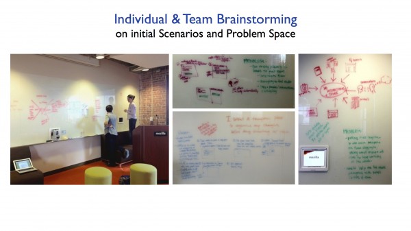
Last week in preparation for a UX event, me and my coworker, Shuo Yang, decided to demystify this topic for a group of junior designers entering the job market. We gave a presentation on best practices during a whiteboard design interview, and practiced a fake design challenge using our 5-step approach, which I summarized in this post.
Why is whiteboard design challenge so important? And what is the interviewer looking for?
Nothing else comes close in demonstrating how a UX designer think and behave than a whiteboard challenge.
From a interviewer’s perspective, whiteboard design challenge is not about how many new ideas you come up with or how beautiful your drawings are; It is about how you approach a problem and work with others as a designer.How you work during the whiteboard design challenge is how you will work with the team, and that’s what the interviewer is evaluating.
During the challenge, the interviewer is looking for following signs to show that you understand basic design principles and what it means to use “Design thinking”:
- Do you ask questions to get clarity on the goal?
- Do you focus on the users and their contexts?
- Do you make valid assumptions and ask the right questions?
- Do you go beyond UI and think holistically about the whole scenario?
- Do you understand basic design principles and patterns?
- Do you mention weaknesses and improvements in your solution?
If you clearly have qualities above, there are also bonus points if you show that you understand the product design process beyond just designing the UI, things like:
- Do you suggest ideas outside the scope of the exercise?
- Do you have suggestions for user research? roadmap? or execution?
- Do you understand the potential technical constrains?
What are some common mistakes you should avoid during a whiteboard design challenge?
Don’t be sloppy! I remember my first design exercise, where I wiggled through every words and UI, making it impossible for anyone, even myself to read. Sloppiness shows that you are panicking. So be quick but don’t be sloppy, write the whole word, draw straight lines.
Don’t stop talking! Another common mistake is silently drawing on the whiteboard without interacting with the interviewer. This might be how you work alone, but should not be how you work in a team. So think out load, ask questions, be interactive.
Don’t just talk! On the opposite of not talking, there is also talking too much. While it’s important to communicate, it is a whiteboard design challenge after all. So don’t just talk and leave with an empty whiteboard, write down what you talked about, especially decisions that guide your design.
Don’t be defensive! When the interviewer asks a question about your design, she/he is not trying to pick on you. She/he is just trying to understand your thinking process. So listen and iterate based on the feedback, defend your design only when needed.
Have a main focus! Again, the goal of a design challenge is not testing how many ideas you can come up with. It is critical to show that you are familiar with common design methods to do day-to-day design work. So don’t have a hundred ideas but end up showing none in details.
My 5-step approach to a whiteboard design challenge
There is no perfect approach to a design challenge interview, everyone has their own process and personalities. However, there is one bad approach, that is to start drawing right away. If that is your approach, I recommend you to try mine and let me know what you think:
- Ask questions to specify the challenge
- Ask about the users and their context
- Write down the main steps of the story
- Draw a few critical screens
- Summarize the story, talk about alternatives, improvements or other use cases
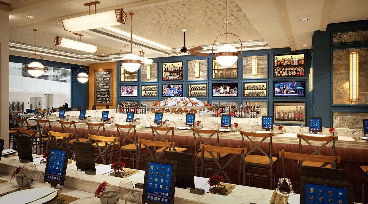
These 5 steps might sound simple in theory and vague in practice. That’s why we came up with a fake design challenge and walked through how we worked on it like we are in a real interview with no preparation in advance. Here’s the design challenge we used:
Design an ordering interface for an airport restaurant
Step 1: Ask questions to specify the challenge
Just like any design project, don’t start designing until you understand what problem you are solving. The first step is asking questions to get more specifics on the design challenge, questions like:
- What is the goal of the design?
- What are some details and context of the challenge?
- What is the timeline, device or other constraints?
Asking these questions not only help you scope down the challenge and guide your design, it also buys you some time to think about the solution.Don’t move on until you are clear on your task.
For our challenge, we asked the following questions and made up some answers:
- What is the goal of the design? A: An efficient, hassle-free and fun dining experience for busy travelers
- What kind of airport? A: International airport
- What kind of restaurant? A: A dine-in restaurant with food and drinks
- What kind of device? A: Tablet devices on each table
Step 2: Ask about the users and their contexts
As user experience designers, it is our job to know about the users. So instead of just asking “who are the users?”, we should make valid assumptions and try to answer these questions instead of just asking them:
- What are the different types of users?
- What are some assumptions of their behaviors & problems?
- What are the common use cases?
- What are the benefits we should provide?
In our design challenge, we summarized different types of travelers and chose to focus on business travelers since they usually travel along and don’t mind spending a bit extra to dine in at an airport restaurant. The benefits of our solution include: skipping the line, paying by card instead of local currency, using a familiar language, checking flight status and having fun while waiting for the flight.
Here’s what our whiteboard looks like after step 1 and 2:
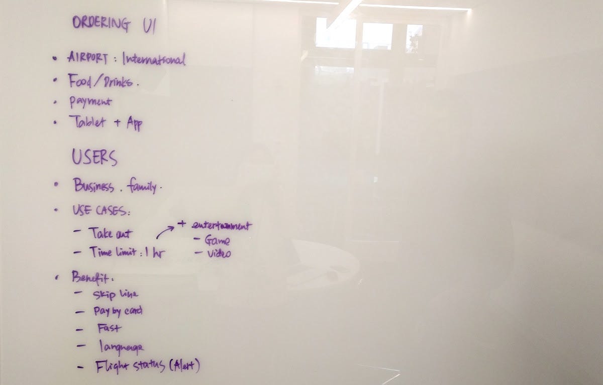
Whiteboard after step 1 and 2
Step 3: Write down the main steps of the story
Now that you understood the problem and the users, it is very important towrite down the main steps of the story before you start drawing. This will help maintain your focus and guide the design along the way. It is also important to only pick one use case to start, and tell a story instead of just drawing screens.
Here’s our story: a business traveler, let’s name him Mike, wants to dine-in at the restaurant before his flight. He chooses his language, looks at the menu, makes his order and pays by credit card. While looking at the food status, Mike checks out the entertainment system and got notified when his flight is boarding.
Here’s our whiteboard after step 3:
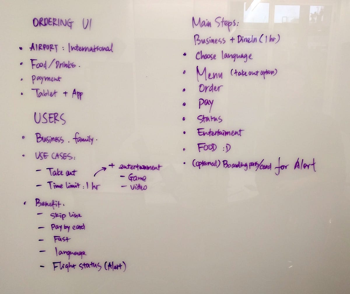
Whiteboard after step 1, 2 and 3
Step 4: Draw a few critical screens
Now it’s time to draw some screens! With the preparation of step 1 to 3, it should be fairly easy to design the UI based on common design patterns. Remember to:
- Draw your story based on what’s listed in step 3
- Draw only the critical screens in the story
- Draw clearly and label the drawings
We started with the welcome screen with language selection, and the menu screen:

Welcome and menu screens
We then added details of the menu, including preview of the food, summary of the order, and how to add or cancel an item.
For the check out screen, we drew a list of orders and payment options. Note that we didn’t go into details of the payment screens, since they are usually very standard and not critical to our story.

Menu details and check out screen
After payment, we finished our story by drawing out ordering status, entertainment options and details on how to enter and check flight status.
Below are all the screens we drew after step 4:
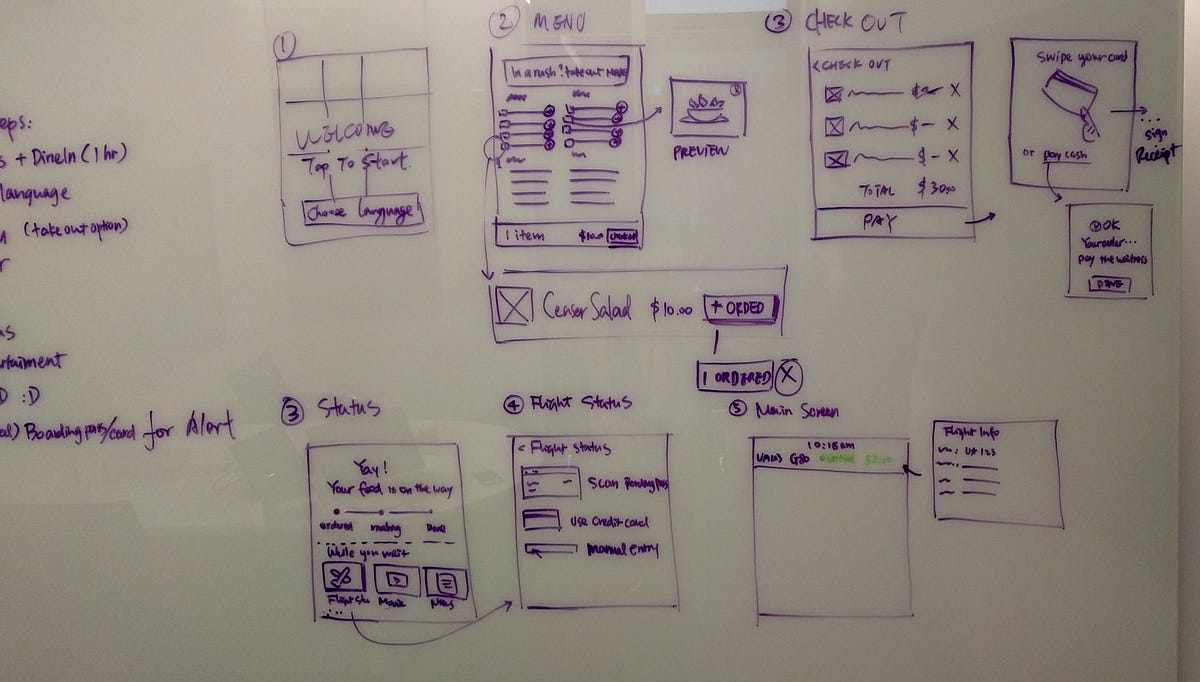
Order status, entertainment and flight status
Step 5: Summarize the story, talk about alternatives, improvements or other use cases
The UI is almost done, but there is one more step if you have time: summarize the story, make any adjustments or improvements, and talk about alternatives or other use cases. You don’t have to go into details of improvements or alternative use cases, talking about them shows that you understand the importance of critiquing and iterating in the design process.
For our challenge, we evaluated our design and added some improvements. We also wrote down some other use cases or questions, like:
- What if this is for a food court at the airport?
- What if this is for a group of people or families?
- What about using one’s own device to make the order?
- How about showing a terminal map?
- …
Voila! Here’s our final whiteboard after all 5 steps. In case you are curious about timing, we spent exactly 50 mins on this challenge(including taking photos each step along the way), roughly 20 mins on step 1 to 3, and 30 mins on step 4 and 5.
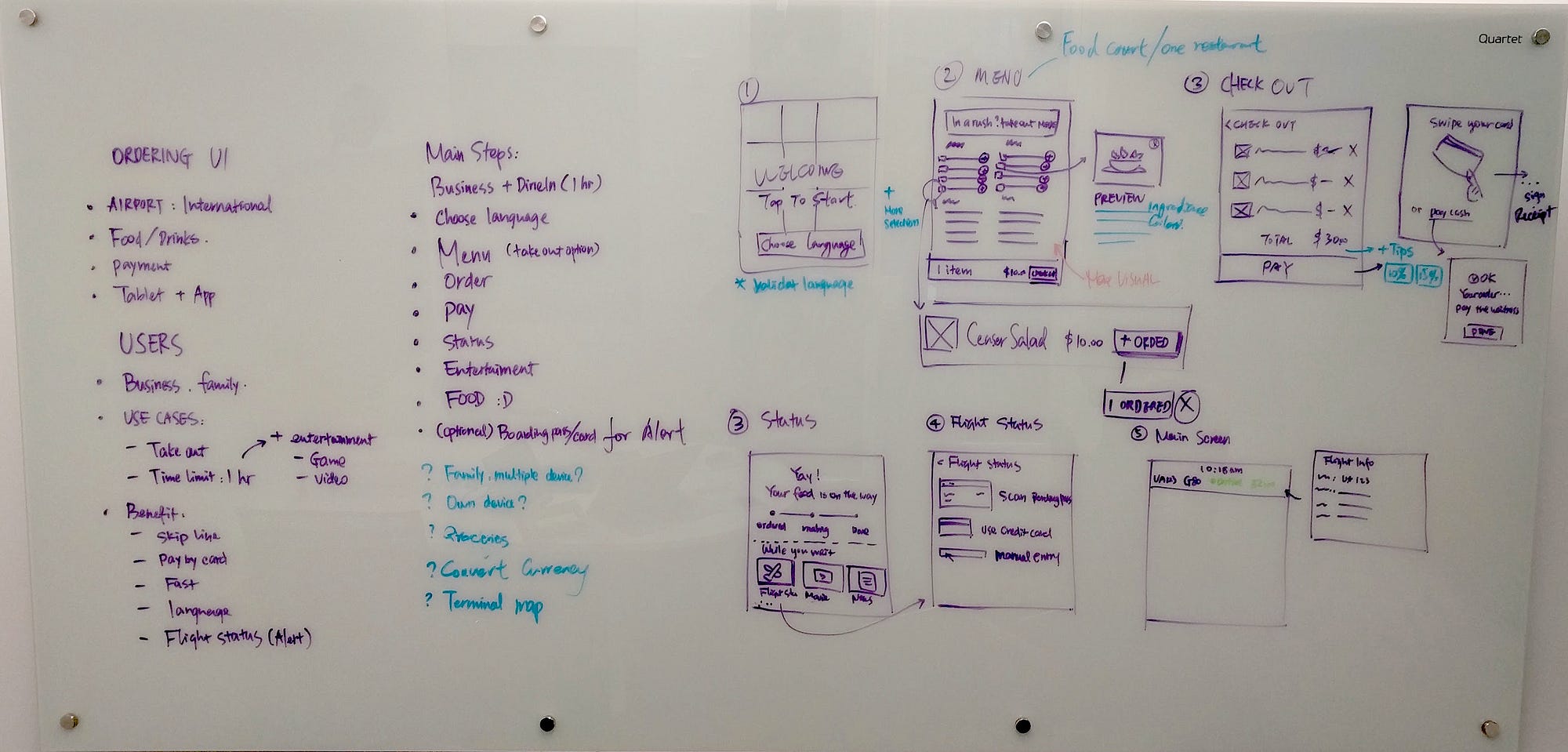
Final whiteboard!
Design is about prioritizing and making compromises, and there is no single correct solution to any design problem. The outcome and details that we showed in this design challenge will vary depend on the questions you asked and decisions you made. But hopefully by showing the process of using these 5 steps, you now have a structured way of approaching a whiteboard design challenge, that will help you demonstrate all your awesome design skills in your next interview.


